纯CSS3文字效果推荐
之前曾经研究过几个纯css实现的文字效果,《CSS文字条纹阴影动画》和《响应式奶油立体字效果》等,今天我们来研究几款文字效果,主要利用text-shadow、webkit内核的几个独有特性实现效果。
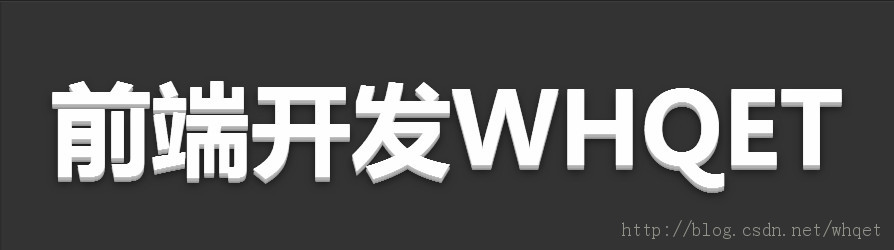
效果一-立体字效果
我们的html文件貌似这样,为了更好的展示效果,我们加上了可编辑属性。


- <div contenteditable="true" class="text effect01">前端开发whqet</div>
<div contenteditable="true" class="text effect01">前端开发whqet</div>
css文件里,我们先看看全局的设置
- body{
- background-color: #666;
- }
- @import url(http://fonts.googleapis.com/css?family=Dosis:500,800);
- .text {
- font-family:"微软雅黑", "Dosis", sans-serif;
- font-size: 80px;
- text-align: center;
- font-weight: bold;
- line-height:200px;
- text-transform:uppercase;
- position: relative;
- }
body{
  background-color: #666;
}
@import url(http://fonts.googleapis.com/css?family=Dosis:500,800);
.text {
    font-family:"微软雅黑", "Dosis", sans-serif;
    font-size: 80px;
    text-align: center;
    font-weight: bold;
    line-height:200px;
    text-transform:uppercase;
    position: relative;
}
然后才是效果一的专属CSS,非常简单,就是用text-shadow实现立体字效果
- .effect01{
- background-color: #333;
- color:#fefefe;
- text-shadow:
- 0px 1px 0px #c0c0c0,
- 0px 2px 0px #b0b0b0,
- 0px 3px 0px #a0a0a0,
- 0px 4px 0px #909090,
- 0px 5px 10px rgba(0, 0, 0, 0.6);
- }
.effect01{
    background-color: #333;
    color:#fefefe;
    text-shadow:
    0px 1px 0px #c0c0c0,
    0px 2px 0px #b0b0b0,
    0px 3px 0px #a0a0a0,
    0px 4px 0px #909090,
    0px 5px 10px rgba(0, 0, 0, 0.6);
}
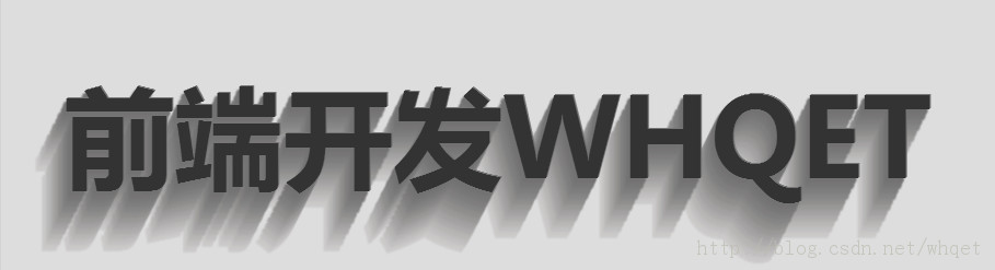
效果二-长尾效果
html文件还是那样
- <div contenteditable="true" class="text effect02">前端开发whqet</div>
<div contenteditable="true" class="text effect02">前端开发whqet</div>text-shadow里面偏移多一点,颜色逐渐简单,长尾效果就来了。
- .effect02{
- color:#333;
- background-color: #ddd;
- text-shadow:
- 1px -1px 0 #767676,
- -1px 2px 1px #737272,
- -2px 4px 1px #767474,
- -3px 6px 1px #787777,
- -4px 8px 1px #7b7a7a,
- -5px 10px 1px #7f7d7d,
- -6px 12px 1px #828181,
- -7px 14px 1px #868585,
- -8px 16px 1px #8b8a89,
- -9px 18px 1px #8f8e8d,
- -10px 20px 1px #949392,
- -11px 22px 1px #999897,
- -12px 24px 1px #9e9c9c,
- -13px 26px 1px #a3a1a1,
- -14px 28px 1px #a8a6a6,
- -15px 30px 1px #adabab,
- -16px 32px 1px #b2b1b0,
- -17px 34px 1px #b7b6b5,
- -18px 36px 1px #bcbbba,
- -19px 38px 1px #c1bfbf,
- -20px 40px 1px #c6c4c4,
- -21px 42px 1px #cbc9c8,
- -22px 44px 1px #cfcdcd;
- }
.effect02{
  color:#333;
  background-color: #ddd;
  text-shadow:
    1px -1px 0 #767676,
    -1px 2px 1px #737272,
    -2px 4px 1px #767474,
    -3px 6px 1px #787777,
    -4px 8px 1px #7b7a7a,
    -5px 10px 1px #7f7d7d,
    -6px 12px 1px #828181,
    -7px 14px 1px #868585,
    -8px 16px 1px #8b8a89,
    -9px 18px 1px #8f8e8d,
    -10px 20px 1px #949392,
    -11px 22px 1px #999897,
    -12px 24px 1px #9e9c9c,
    -13px 26px 1px #a3a1a1,
    -14px 28px 1px #a8a6a6,
    -15px 30px 1px #adabab,
    -16px 32px 1px #b2b1b0,
    -17px 34px 1px #b7b6b5,
    -18px 36px 1px #bcbbba,
    -19px 38px 1px #c1bfbf,
    -20px 40px 1px #c6c4c4,
    -21px 42px 1px #cbc9c8,
    -22px 44px 1px #cfcdcd;
}
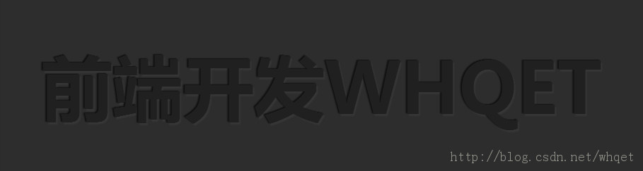
效果三-内阴影
html文件
- <div contenteditable="true" class="text effect03">前端开发whqet</div>
<div contenteditable="true" class="text effect03">前端开发whqet</div>css文件
- .effect03{
- color: #202020;
- background-color: #2d2d2d;
- text-shadow:
- -1px -1px 1px #111111,
- 2px 2px 1px #363636;
- }
.effect03{
  color: #202020;
  background-color: #2d2d2d;
  text-shadow:
    -1px -1px 1px #111111,
    2px 2px 1px #363636;
}
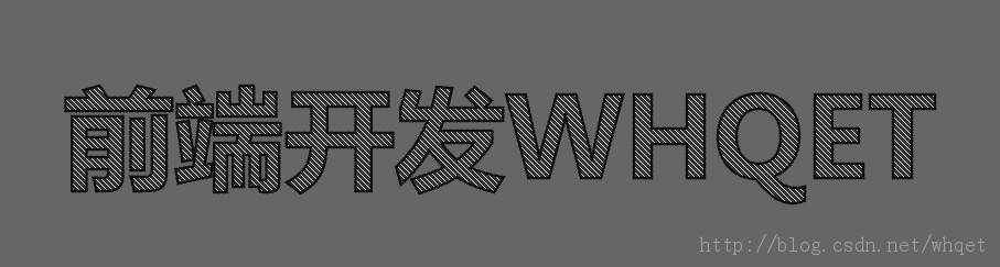
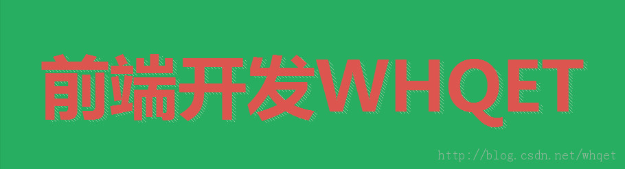
效果四-斜纹字描边效果
- <div contenteditable="true" class="text effect04">前端开发whqet</div>
<div contenteditable="true" class="text effect04">前端开发whqet</div>css文件,使用linear-gradient对div设置条纹背景、只在文本上显示背景(-webkit-background-clip: text;)、文字颜色透明(-webkit-text-fill-color: transparent;)和文字描边(-webkit-text-stroke: 2px #111;)实现。
- .effect04{
- background-color: #333;
- background-image:
- linear-gradient(
- 45deg,
- transparent 45%,
- hsla(48,20%,90%,1) 45%,
- hsla(48,20%,90%,1) 55%,
- transparent 0
- );
- background-size: .05em .05em;
- -webkit-background-clip: text;
- -webkit-text-fill-color: transparent;
- -webkit-text-stroke: 2px #111;
- }
.effect04{
  background-color: #333;
  background-image:
      linear-gradient(
        45deg,
        transparent 45%,
        hsla(48,20%,90%,1) 45%,
        hsla(48,20%,90%,1) 55%,
        transparent 0
        );
    background-size: .05em .05em;
  -webkit-background-clip: text;
  -webkit-text-fill-color: transparent;
  -webkit-text-stroke: 2px #111;
}
效果五-文字条纹动画
html文件
- <div data-text="前端开发whqet" class="text effect05">前端开发whqet</div>
<div data-text="前端开发whqet" class="text effect05">前端开发whqet</div>css文件,利用:before伪对象来显示条纹,并对之添加动画。
- .effect05{
- color:#DC554F;
- background-color:#27ae60;
- z-index: 3;
- }
- .effect05:before{
- content:attr(data-text);
- width:100%;
- line-height:200px;
- opacity: .5;
- position: absolute;
- top:2px;
- left:5px;
- background-image:
- linear-gradient(
- 45deg,
- transparent 45%,
- hsla(48,20%,90%,1) 45%,
- hsla(48,20%,90%,1) 55%,
- transparent 0
- );
- z-index:-1;
- background-size: .05em .05em;
- -webkit-background-clip: text;
- -webkit-text-fill-color: transparent;
- animation: shadowGo 20s linear infinite;
- }
- @keyframes shadowGo{
- 0% {background-position: 0 0}
- 0% {background-position: -100% 100%}};
.effect05{
    color:#DC554F;
    background-color:#27ae60;
    z-index: 3;
}
.effect05:before{
    content:attr(data-text);
    width:100%;
    line-height:200px;
    opacity: .5;
    position: absolute;
    top:2px;
    left:5px;
    background-image:
      linear-gradient(
        45deg,
        transparent 45%,
        hsla(48,20%,90%,1) 45%,
        hsla(48,20%,90%,1) 55%,
        transparent 0
        );
    z-index:-1;
    background-size: .05em .05em;
    -webkit-background-clip: text;
    -webkit-text-fill-color: transparent;
    animation: shadowGo 20s linear infinite;
}
@keyframes shadowGo{
    0% {background-position: 0 0}
    0% {background-position: -100% 100%}};
效果六-描边文字
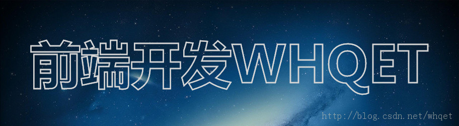
html文件
- <div contenteditable="true" class="text effect06">前端开发whqet</div>
<div contenteditable="true" class="text effect06">前端开发whqet</div>css文件
- .effect06 {
- -webkit-text-fill-color: transparent;
- -webkit-text-stroke: 2px #d6d6d6;
- background: url(http://www.pencilscoop.com/demos/CSS_Text_Effects/images/galaxy.jpg);
- background-size: cover;
- }
.effect06 {
    -webkit-text-fill-color: transparent;
    -webkit-text-stroke: 2px #d6d6d6;
    background: url(http://www.pencilscoop.com/demos/CSS_Text_Effects/images/galaxy.jpg);
    background-size: cover;
}
效果七-遮罩文字

html文件
- <div contenteditable="true" class="text effect07">前端开发whqet</div>
<div contenteditable="true" class="text effect07">前端开发whqet</div>css文件
- .effect07 {
- background: url(http://www.pencilscoop.com/demos/CSS_Text_Effects/images/galaxy.jpg) #333;
- -webkit-background-clip: text;
- -webkit-text-fill-color: transparent;
- background-size: cover;
- animation: 10s infinite linear animate;
- }
- .effect07:before {
- content:"";
- width:100%;
- height:100%;
- position: absolute;
- left:0;
- top:0;
- background-color: #999;
- z-index: -1;
- }
- @keyframes animate {
- 0% {
- background-position:0;
- }
- 100% {
- background-position:-1000px 0;
- }
- }
.effect07 {
    background: url(http://www.pencilscoop.com/demos/CSS_Text_Effects/images/galaxy.jpg) #333;
    -webkit-background-clip: text;
    -webkit-text-fill-color: transparent;
    background-size: cover;
    animation: 10s infinite linear animate;
}
.effect07:before {
    content:"";
    width:100%;
    height:100%;
    position: absolute;
    left:0;
    top:0;
    background-color: #999;
    z-index: -1;
}
@keyframes animate {
    0% {
        background-position:0;
    }
    100% {
        background-position:-1000px 0;
    }
}
效果八-3D炫光效果
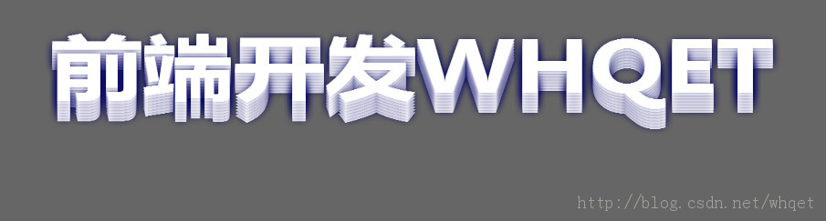
html文件